Most of you know that light determines the colours of objects. Under white light, an apple appears red because it reflects the red part of the colour spectrum while absorbing the other wavelengths.
If we use a filter to remove the red from the light source, the apple will look barely visible and black.
So is light colour?
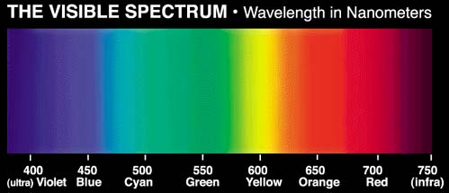
In a way, the answer is yes. Think of the visible spectrum of electromagnetic energy (light) as a series. At one end, with the short wavelength, is violet, and at the other, with the long wavelength, is red. The remaining colours lie between the two ends. Light that contains all the colours of the series is therefore white!
The fact that the colour spectrum can be altered with filters means we can change the colour appearance of objects without ceasing to perceive their characteristics.
Within reasonable limits, the human brain always compensates for changes in colour rendering, so that we perceive objects as we know them and expect to see them.
Because it cuts out certain colours of the spectrum, white light can take on various shades, just like sunlight, which changes from hour to hour. We see a different white light in the morning, at midday and in the afternoon.
The ideal white is considered to be so-called direct noontime light, which is perfectly balanced in colour and quantity when the sun is directly overhead. For lamps, it is referred to as DayLight.
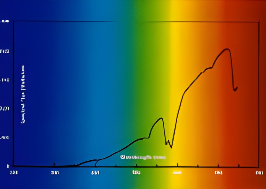
In technical lighting, incandescent lamps produce more red and yellow than blue and green, so objects appear “warmer”.
Because of the way these lamps are made, we cannot intervene in the result they produce. With light from fluorescent or high-pressure lamps, on the other hand, newer technology allows us to shape the result we get.
It is generally agreed that balanced white light makes colours look more natural and more vivid. Nevertheless, a particular portion of the spectrum is the most important for the colour rendering of objects. Red, blue and green, as the primary colours, can be combined to create almost any other colour. It follows that a light source containing balanced amounts of red, blue and green can provide excellent rendering even if it is deficient in other colours of the spectrum.